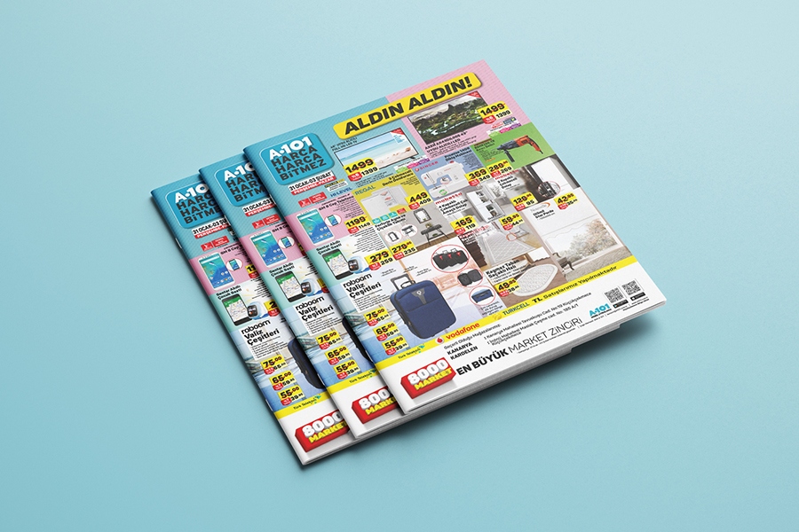
In the printing of A5 multipage brochures, there is an advertisement area where they can easily advertise the prices and campaigns of the service offered by the company. Brochures can also be evaluated as a booklet with a few pages that gives information about the services or products of the companies.
A broad description of the company's products and services can also be made in the multi-page brochures. For this reason, brochures provide the opportunity to provide satisfactory information to the addressed people. Thanks to the brochure, people are aware of the products and services of the company and can reach them in the shortest way. It is a type of printed product where everything from a very short history of the business or company to the product being sold and the services being provided can be explained to potential customers with a brochure, regardless of the size of the business, the company and whatever field it operates.
For brochure printing, the quality of your design contributes to inform the target audience about your related products and services. With quality brochures and content, you can increase your brand value and gain additional value in terms of prestige.
In order to get the most out of your printed brochures, it will be useful to pay attention to some points in the design:
• Brochure prints should primarily be suitable for the target audience to be determined and should be designed in accordance with the target audience. Content and visual selection should be carefully determined and strategically chosen. In order to create the right design, it will be useful to do a short research and take a look at the examples made before. In parallel with the target audience and brand identity, more modern or classical choices can be made, and an accurate design can be made by choosing the paper sizes that will best suit the purpose of distributing brochures.
• In the content of the brochure, it is necessary to make sure that all the messages about the institution are given to the customers and everything they want to know about the institution, products and services. Of course, how these are conveyed in the brochure is also important. Brochure design should encourage reading and, after reading, it should prompt the reader. It will be more effective to use shorter, catchy and remarkable sentences instead of using very long and boring sentences in the expression. Expressions made with items instead of long paragraphs attract more attention. Trying to express more with short and concise sentences in design would be the right step. The less and more concise information is given, the higher the reading rate will be. With the use of emphasized language, direct addressing to the customer will be more impressive. Besides, the brochure contents should be easy to read; It should reach the goal in a simple and fluent way without causing confusion. In order for the inscriptions on the brochure design to be easily readable, it is necessary to use certain fonts. It is very important at this point that you choose a font size suitable for the design and general size. It is better to work with a maximum of three different fonts by adhering to the standards as much as possible in order to avoid visual confusion in the articles. In addition, it should be taken into consideration that texts smaller than 10 points will be difficult to read while setting the font sizes. Paying attention to legibility in both design and text will make your brochure more appealing to both the eye and the mind. In order for the inscriptions on the brochure design to be easily readable, it is necessary to use certain fonts. It is very important at this point that you choose a font size suitable for the design and general size. It is better to work with a maximum of three different fonts by adhering to the standards as much as possible in order to avoid visual confusion in the articles. In addition, it should be taken into consideration that texts smaller than 10 points will be difficult to read while setting the font sizes. Paying attention to legibility in both design and text will make your brochure more appealing to both the eye and the mind. In order for the inscriptions on the brochure design to be easily readable, it is necessary to use certain fonts. It is very important at this point that you choose a font size suitable for the design and general size. It is better to work with a maximum of three different fonts by adhering to the standards as much as possible in order to avoid visual confusion in the articles. In addition, it should be taken into consideration that texts smaller than 10 points will be difficult to read while setting the font sizes. Paying attention to legibility in both design and text will make your brochure more appealing to both the eye and the mind. It is better to work with a maximum of three different fonts by adhering to the standards as much as possible in order to avoid visual confusion in the articles. In addition, it should be taken into consideration that texts smaller than 10 points will be difficult to read while setting the font sizes. Paying attention to legibility in both design and text will make your brochure more appealing to both the eye and the mind. It is better to work with a maximum of three different fonts by adhering to the standards as much as possible in order to avoid visual confusion in the articles. In addition, it should be taken into consideration that texts smaller than 10 points will be difficult to read while setting the font sizes. Paying attention to legibility in both design and text will make your brochure more appealing to both the eye and the mind.
• It is extremely important to benefit from not only verbal expression but also visual expression in the brochure. Expressing them not only with text writings but also with visual expression will make the messages more catchy. Images are the first to catch the reader's attention in the brochure. For this reason, individual attention should be paid to visual selections. Your images should definitely not be ordinary and arouse curiosity to the other person. Using high quality and stylish images while preparing brochures will make your brochure more effective.
• Attention should be paid to the colors used in order to attract the attention of the target audience and to create a brochure that will suit the reputation and personality of the brand. The colors that best reflect the corporate identity of the company should be selected and these colors should be in harmony with each other. Care should be taken in choosing colors. It is true that bright and vivid colors are more noticeable, but the harmony between colors is much more important in making a brochure readable. The most striking point of the brochure is its color tone and visual choices. Because the color match is directly related to whether the person reading the brochure continues to examine that brochure or not. It is necessary not to use tones that are absolutely incompatible with each other. As with all other marketing communication materials, using the corporate logo and emphasizing the colors in the logo will increase the brand perception when designing a brochure. Care should be taken that the other colors you will use are compatible with the corporate colors.
• When designing a brochure, firstly, when the brochure is extended to potential customers, the first place they see is the cover page, and an attractive and remarkable visual and an attractive slogan should be included on the cover. Considering that the cover is the first meeting point with the customer, it is necessary to use visuals and slogans on the cover that will create the desire to read the rest of the brochure and whatever message is to be given should definitely be on the cover. In this way, the reader will be able to easily understand whether the information he / she is looking for in the content.
• Due to the large variety of sizes of brochure prints, the selected sizes should be decided. There are more than one type of brochure and these are; single sided leaflet, double sided leaflet, folded leaflet. It is necessary to choose the right brochure according to the field where the company works. Coated papers or matte specially textured papers can be used as paper in brochure printing. In brochures printed as a single page, sometimes thick papers can also be used for prestige purposes. In terms of visuality and posture given by thick papers, it becomes more elegant with a quality print. If the brochure is designed as a single page, it is useful to use glossy paper when printing is desired on the back surface.
• Finally, it is absolutely necessary to include contact information in the brochure. In this way, sharing the contact information of your institution in your brochures will enable the people to whom the brochure is given can easily reach when needed.
Factors Affecting the Cost of Brochure Printing
Number of brochure pages
The size of the paper to be used (A3-A4-A5-A7 each has a price difference)
The quality of the paper to be used
Number of brochures to be printed
How many pages will be printed (Duplex / One sided)
Extra Workmanship That Can Be Applied After Printing
There are some post-printing extra labor that can be applied after printing the brochure. It can be applied from extra workmanship to have quality and more professional brochures.
♦ Cellophane application after brochure printing: Cellophane is a transparent and thin coating that provides extra protection to products. It is a lamination method applied to protect printing products against water, light and other external factors. It is applied to the product after printing and is applied to protect the paper products against external factors. The wear and tear of the product becomes difficult, it is prevented and thus the service life of the product is extended and its quality and durability increase. With the cellophane coatings, which are generally preferred to be used in post-printing works in printing, highly durable and aesthetic brochure designs emerge.
♦ General or partial lacquer after brochure printing:
With the lacquer application, the paper surface becomes highly resistant against scratches, moisture, sunlight and dispersion of the pressure on the paper. In addition, the varnish is applied to the printing surface, making the product look bright and attractive. If gloss is desired in brochures, lacquer application is a common method. Lacquer application is a method that can only be applied to coated papers. 1. Lacquer application does not give good results in pulp papers and fancy papers. Therefore, it should be taken into consideration when choosing paper. Lacquer is usually applied to all paper, but only partially in practice. It is possible to obtain different designs with the lacquer application made only to certain parts of the product, called Partial Lacquer. The logo on the paper printed with partial lacquer, It can be applied to specially desired parts such as the image on it. Silver and gold gilding can also be applied to the design with lacquer process. Thus, lacquer application adds elegance to your products and allows you to obtain a different design.
♦ Special cutting in brochures: It is the process of cutting the brochures in different ways after the printing phase is completed. People who want to stand out by making a difference in design can choose. Brochures are generally produced as straight cuts, but special cuts can be applied upon request.
In addition to being the most preferred among the classic advertising tools, brochures are one of the printed product types with the highest potential to provide positive feedback to the company. With brochures, you can introduce your company to your potential customers in the most practical way, and inform them about your campaigns or new services collectively.
eymenajans.com You can have high quality multi-page brochures in a short time by placing your brochure printing order online, which will allow your potential buyers to easily access information about your service.
If you want to work with its expert and experienced team, 24/7 eymenajans.com is just a click away.
What to Consider Before Ordering Brochure Prints?
• The priority in the design is the brochure size. Design should be made according to the size of the paper to be printed, and a cutting margin should be left in the design so that the design is not damaged during the printing phase.
• It should be ensured that the product and its promotions are given in sufficient detail in the brochure prints. Try to express a lot in design with simple and perceptible sentences. Using an emphatic language without using too long texts will improve reading.
• The font size used should not make it difficult to read, you should choose an easily readable font size. At the same time, at most three or four different font sizes should be used, as using very different fonts can cause a complex image.
• You should take care that the colors to be used are compatible with the company colors and at the same time attract attention. You should avoid using too many complex colors.
• In addition to written expression, visual expression should also be used in your brochure design. Diagrams, pictures and photos help make your message more memorable.
• Make sure to include your contact information in the brochure content. In order for your potential customers to reach you, up-to-date contact information, social media accounts and map information can also be added.
• The brochure cover is the first point of contact with the customer, so visuals and slogans should be used on the cover to create the desire to read the rest of the brochure.
• Brochure printing prices are the most important factor affecting the cost, the number of pieces should not be less or more than your needs should be calculated correctly. When calculating the number of pieces, you should also take into account that the leaflets run out very quickly.
• You can get ideas about the design by examining the ready-made brochure designs on the internet.
• If you want the extra workmanship to be used after printing, it must be specified before order.
• If you have difficulties in creating the brochure design, you can use ready-made templates or if you say you want a custom brochure design, you can safely benefit from the expert and experienced design support team of eymenajans.com.
Information requested in the design:
• Brochure quantity information
• Brochure size information (Open and Closed)
• The weight and type of paper to be used
• How many colors will be printed
• Whether it is cellophane
• From the extra labor after printing;
• Local or Partial Coating
• It is requested whether there is a foil printing (silver, gold).


